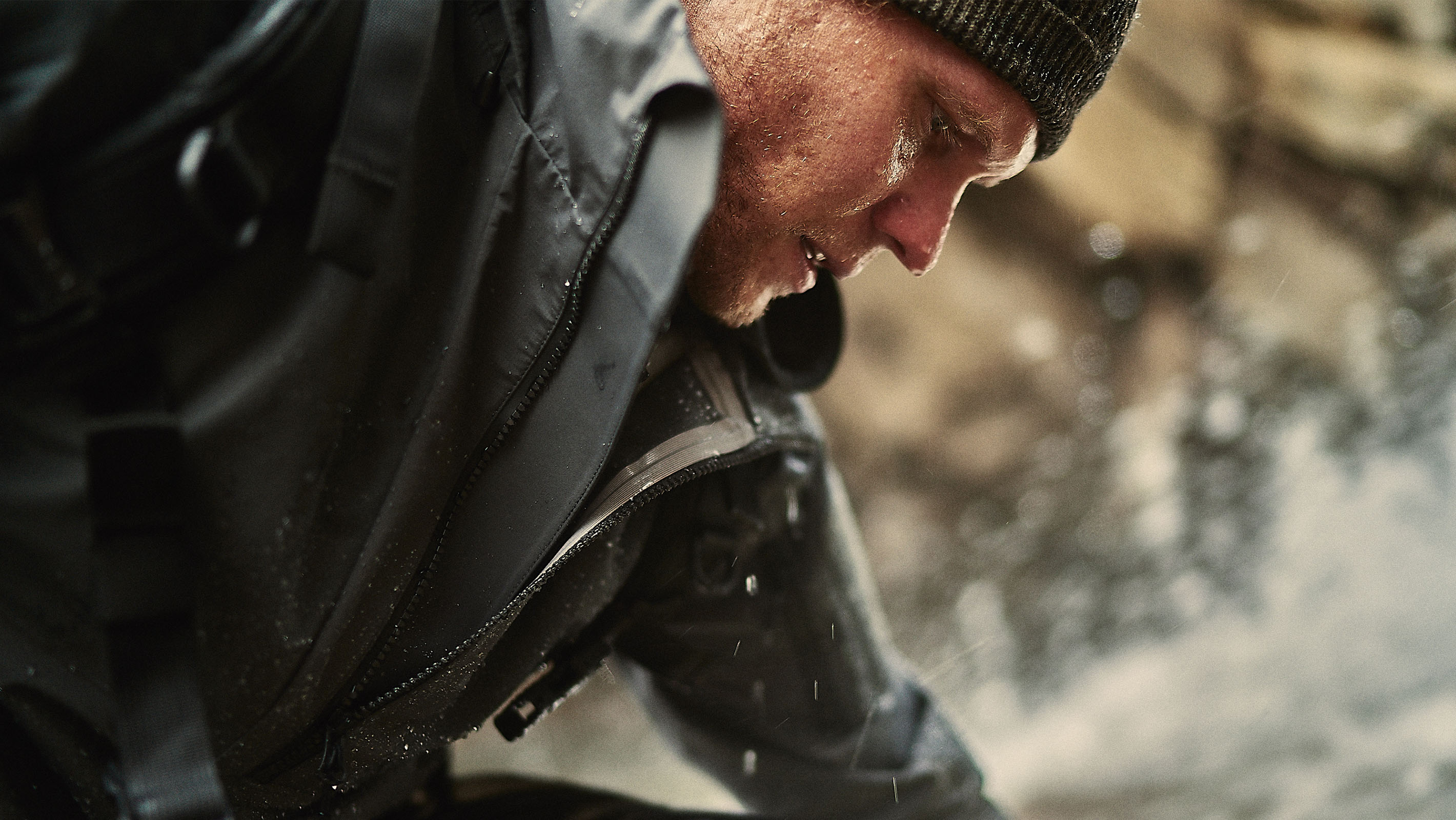
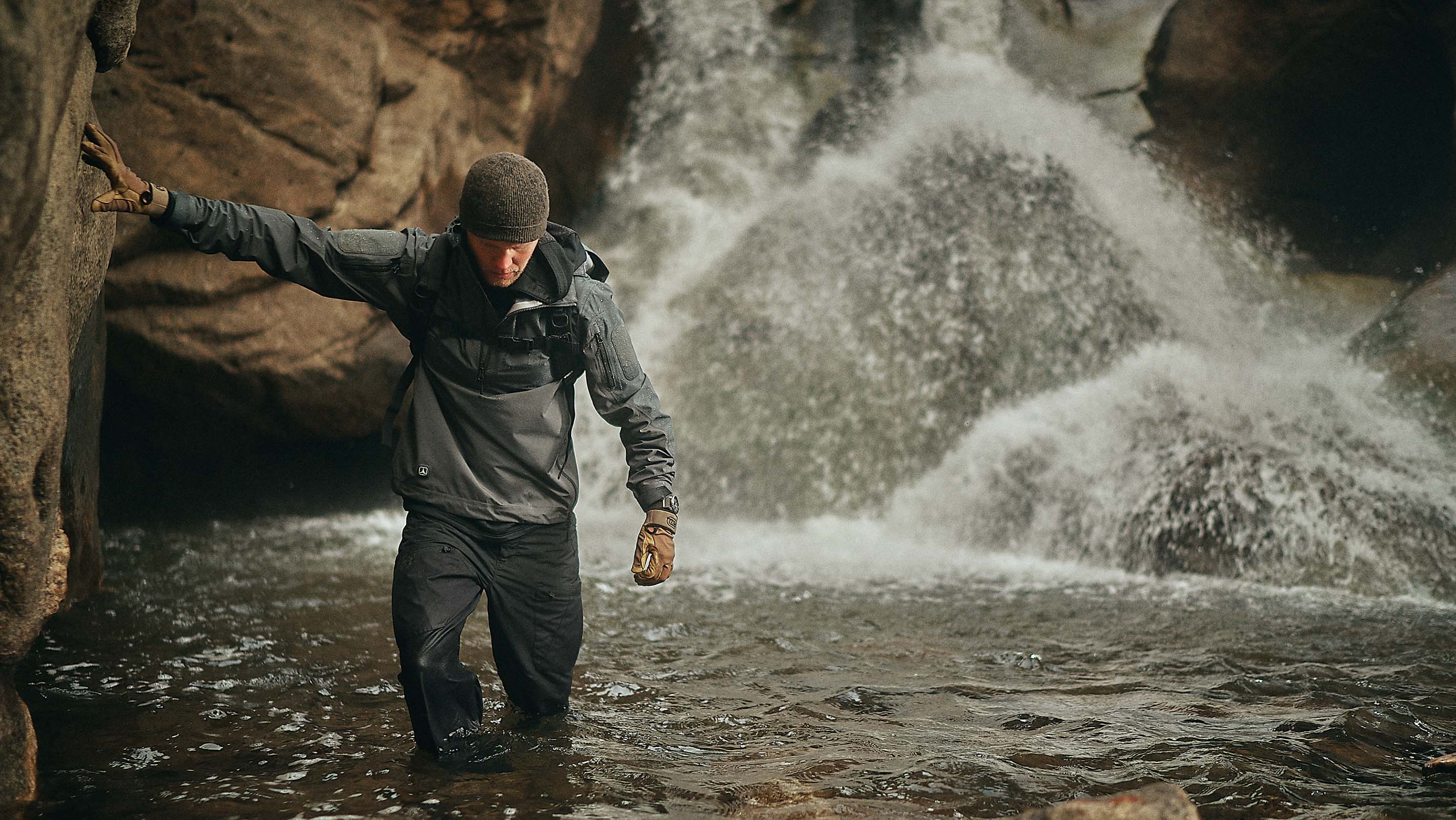
Triple Aught Design is a small, employee-owned company on a mission to inspire communities to live more adventurous lives. They create gear and apparel with exceptional quality and engineered functionality, purpose-built for the capable individual.
Art Direction
Brand Identity
UX / UI
E-Commerce
Events
Marketing Director: Phil Adams
Photography: Matt Ritscher, Kris Cheng
The aim of the project was to elevate the entire Triple Aught Design brand experience, with updates throughout the brand identity, art direction and e-commerce.
To start, the wordmark was modified to maintain integrity across diverse applications. The new center-aligned lockup establishes a commanding presence and elevates the iconic logo, allowing for opportunites to drop the wordmark when needed.
Identity updates were carried through to marketing materials, signage and product graphics.
Triple Aught Design sales are 95% direct to consumer via their website. For a gear and apparel company, this means communicating a product's form, fit, feel and value using brand content alone.
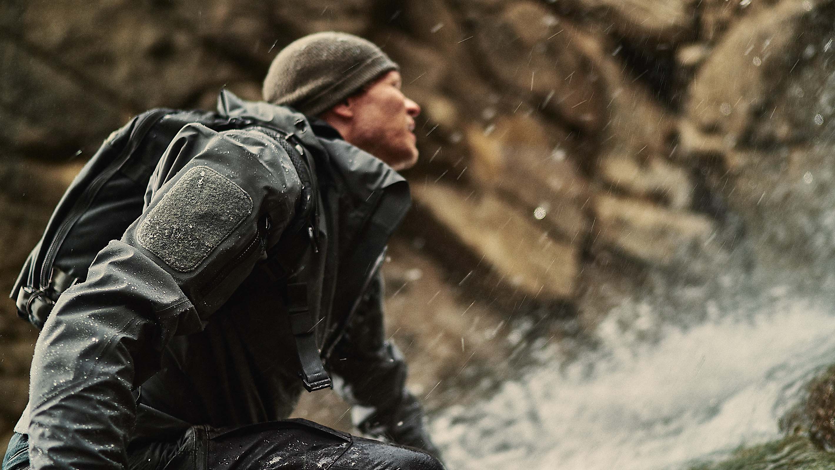
The existing website showcased impressive lifestyle photography, but fell short in most other aspects. The site needed to inspire users not just to purchase products, but also empower them to lead more adventurous lives.
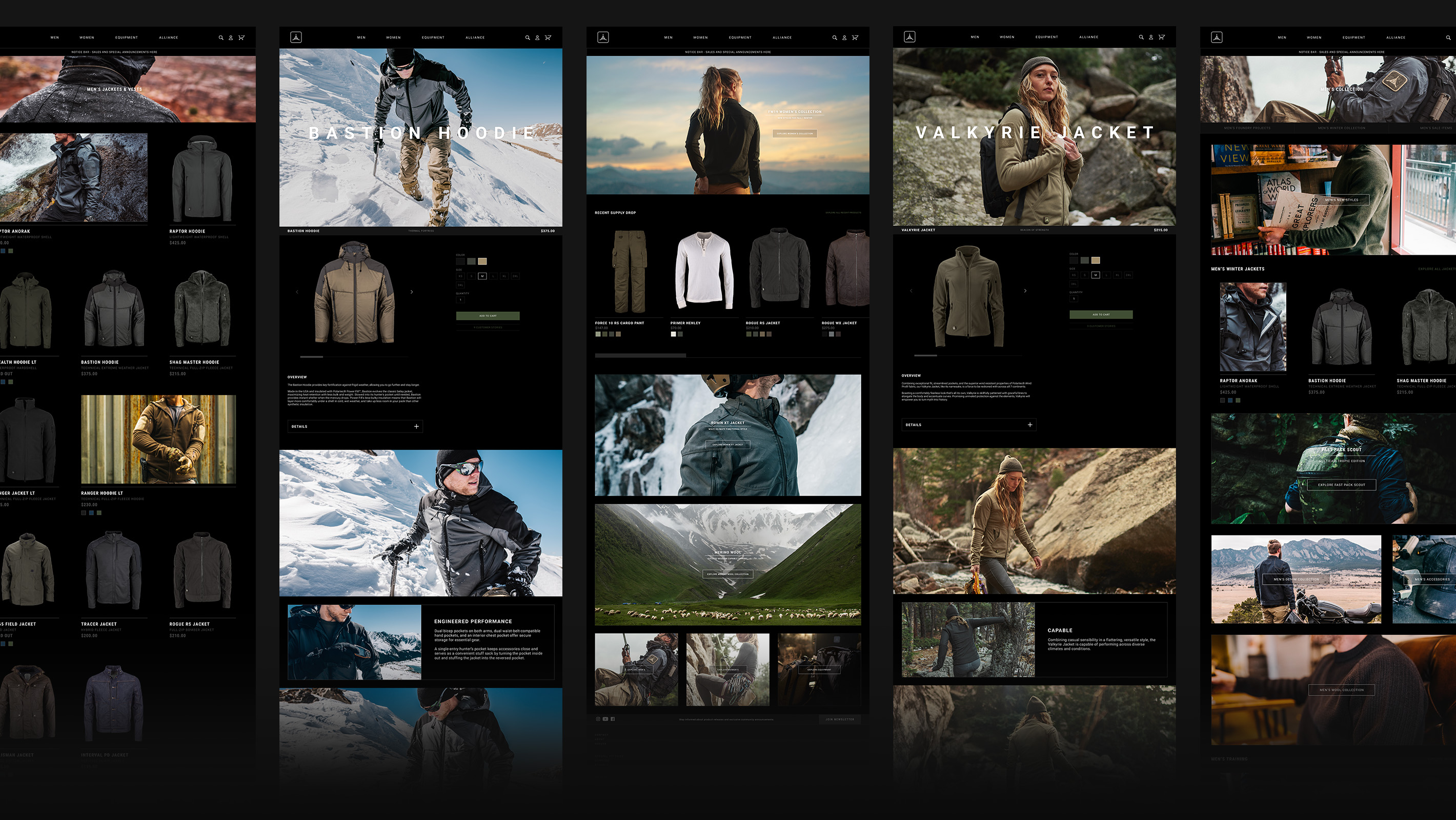
To achieve this, we redefined online shopping by creating a story-driven e-commerce experience.
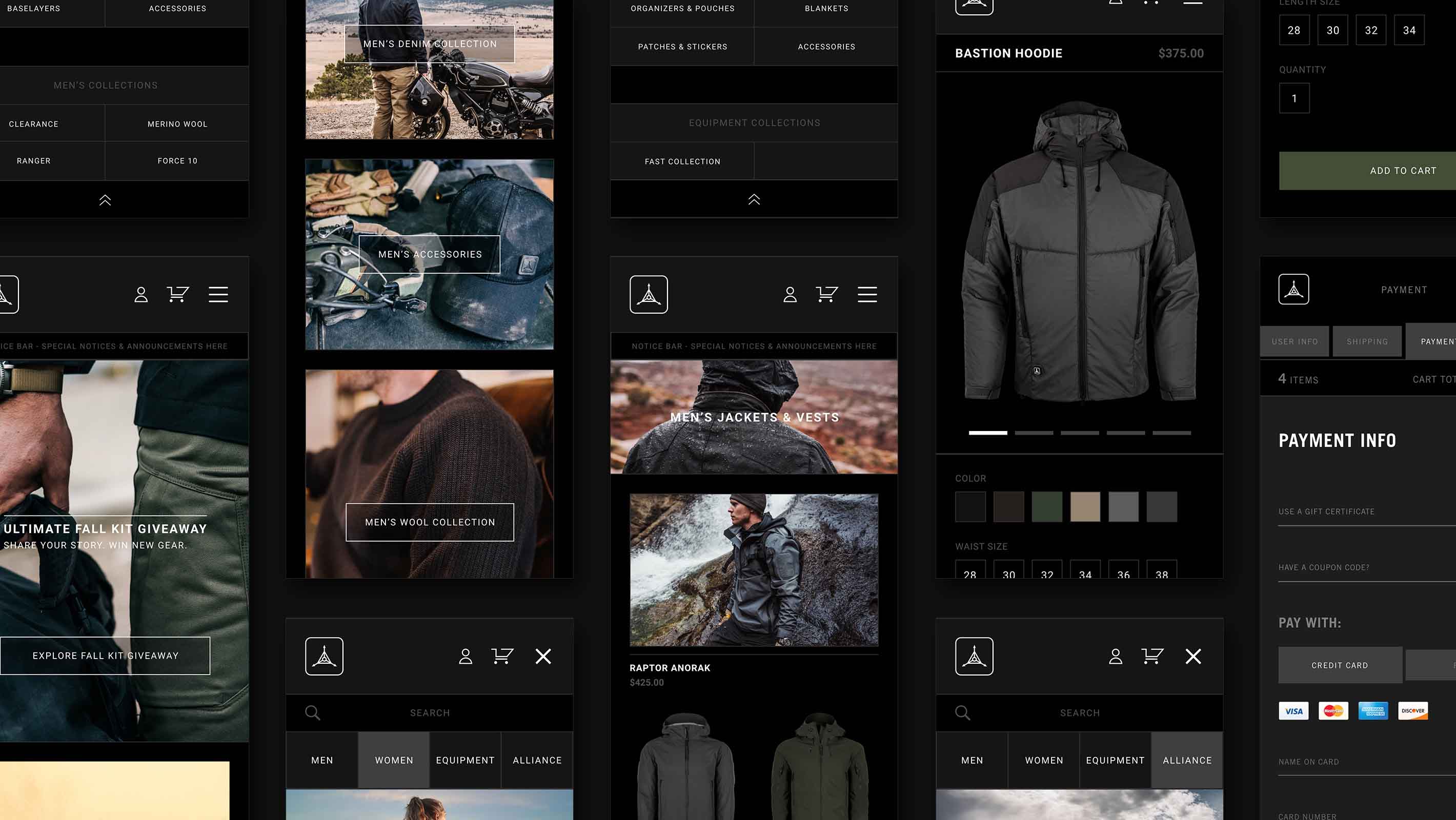
Refining the user interface maximizes brand story content without sacrificing function, page features or product placement.
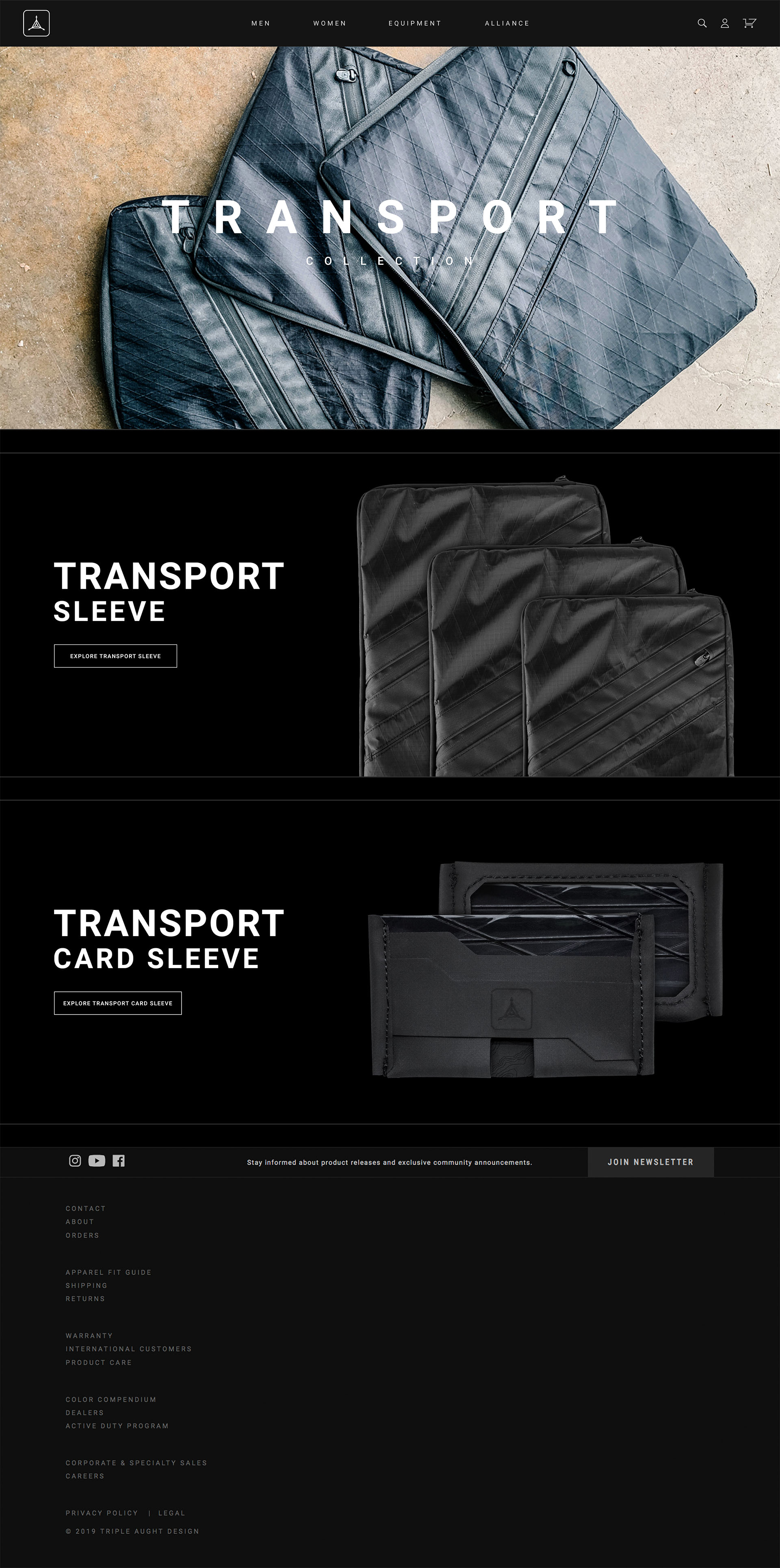
While product story is always the primary focus, studio photography was essential to communicate a product's form, fit and material.
Shooting and editing processes were standardized to ensure products maintained consistent size, exposure, accurate material color and are posed to best show their ideal fit.
Using 3-column product grids allowed for emphasis on select products and provides even more opportunities to utilize story content. This layout also holds up responsively on mobile devices using reduced, two-column grids.
Product collections are elevated beyond traditional product grids, with modules that highlight both shared and distinct product features.
Sales modules are given secondary priority to story elements, generating brand value that incentivizes checkout, rather than ambusing users with an immediate sales pitch.
The pursuit of adventure begins with an inspired mission.
The right gear makes it not only possible, but makes you:
MISSION CAPABLE
This principle guided our story-driven, e-commerce experience.
Through product stories centered around adventure,
we created a brand story that redefines online shopping.
© Brandon Herring. All Rights Reserved.
All product names, logos and brands are property of their respective owners.
All company, product and service names used in this website are for identification purposes only.